Time: Fall 2019
Duration: 2-3 weeks
Skills: UX/UI, User Testing, Wireframing, Prototyping, High Fidelity Visual Design, Design Systems
Tools: Figma, InVision
There are two critical elements in the lifestyles of musicians: organization and communication. Organization is an incredibly valuable skill, however, it can be difficult to keep up with. Constant movement between rehearsals, lessons, and practice allows for loose materials such as notes and sheet music to be lost in transit. Communication and performance feedback from peers and teachers is equally significant in a musician’s success. Tenuto effectively organizes notes and sheet music while also providing users with communication tools essential to their personal progress as musicians.
The Problem:
Part of the challenge for this design was to create a list of everyday experiences that I felt could be improved. I chose a music experience because I felt that it’s inclusivity to a diverse audience would allow for flexibility of application by the user. No matter the skill level or background, musicians of all kinds require two necessities in order to make progress, organization and communication. Music, although intangible in some aspects, lives in the physical realm of sheet music, staff paper, and hand-written annotations. These elements tend to be lost or discarded, ultimately wasting time and paper. Efficient and effective communication also plays an incremental role in a musician’s success. Nowadays, text messaging can be seen as unprofessional while emailing can result in slow responses. How can organization and communication be combined to create an experience that addresses the needs of all kinds of musicians?
The Solution:
By adding value to the user’s musical experience through hassle-free interfaces that focus on efficient music organization and professional communication. The features within this app are meant to be user friendly to all types of music lovers, from beginners to pros or classical musicians to rockstars. Creating easy-to-use digital sheet music organization saves time and reduces paper while allowing users to mark-up scores and take notes. Professional platforms allow students to communicate with their teachers without the awkwardness of texting with personal phone numbers. With these concepts in mind, Tenuto focuses on two main ideas: the value of organization and the importance of maintaining strong, professional relationships between musicians.
Interviews:
I began my design process by interviewing six musicians about their experiences with organization and communication. These interviews were approximately a minute long, consisted of 10 questions, and were conducted in person or over the phone. By initiating these conversations, I was able to better understand how musicians are currently organizing and communicating. This also gave me the opportunity to brainstorm how these factors could be enhanced to add value to a user’s experience. The feedback gained from these conversations is highlighted below.
● Four out of the six interviewees were music majors while the other two had experience with instruments but were not playing regularly. Half of the interviewees did not have a way to track their music, but all interviewees felt that this would be helpful.
● Four out of the six interviewees felt that a professional communication platform would be a useful feature. When asked why, those who felt differently inferred that they “often see their professors or peers throughout the day”, while those who wanted a community platform felt that it would be useful in allowing for quick questions or feedback from peers or teachers.
The information received during this research was influential to my design decisions throughout the rest of the process. Not only did this reaffirm my research that organization and communication plays a large role in the lives of musicians, but it also helped me to consider how musicians of all levels might approach these factors differently.
Competitive Research:
Part of the challenge for creating this app was defining a concept that isn’t currently on the market. This was difficult to do considering the plethora of apps that already exist out in the world. I searched the app store to verify that my concept was original and was unable to find an application that combined sheet music organization, history, and communication within one experience. I did however, find Musicnotes, an app that focuses on collecting and organizing sheet music.
Musicnotes
Created in 2018, Musicnotes allows users to browse and shop for sheet music that can later be transposed or listened to.
Created in 2018, Musicnotes allows users to browse and shop for sheet music that can later be transposed or listened to.
Browse: features “top sheet music”, “new sheet music”, and an about section
Wish List: allows user to save sheet music that they are unable to purchase at that time
Library: personalized library of songs
PDFs: allows user to upload their own pdfs for transcription
Musicnotes provides the user two options for obtaining music, uploading personal pdfs, or purchasing music from the store. This was an interesting feature that I felt would be useful in terms of affordability, however I felt that uploading pdfs might seem a bit redundant unless the user were uploading original compositions. Websites like IMSLP already allow users to download pdfs directly from their website. Moving forward in my design process, I wanted to consider how my app might interact with websites like IMSLP for easier pdf downloads.
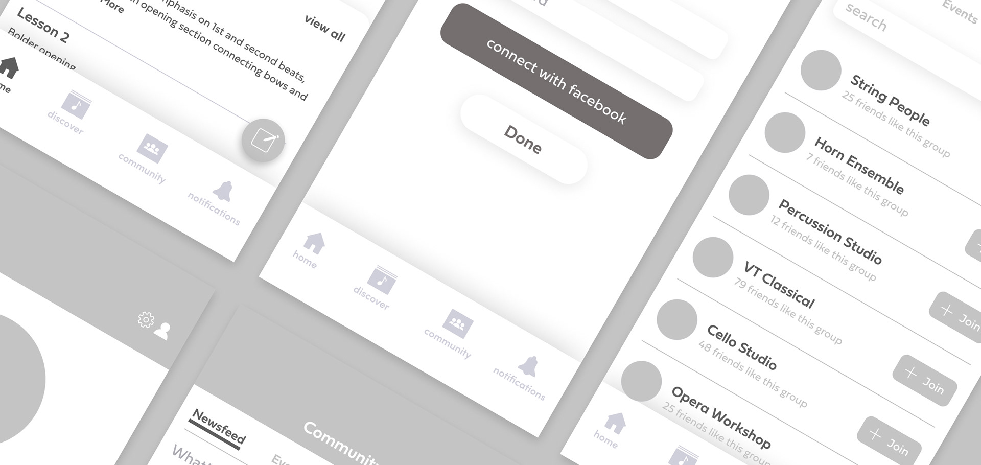
User Testing and Prototyping:
This design was limited to six screens of the app, including the splash screen. In order to provide a comprehensive overview of the experience, I chose to create the initial login screen, the home tab, the newsfeed and group screens of the community tab, and the profile tab. These screens were chosen to visualize the main ideas within the app, music organization and professional communication. User testing was performed by five individuals who were given three tasks to complete with six individual paper screens. These tasks included the following:
● Adding music to your library
● Viewing groups
● Viewing profile
Users were able to move throughout the interface fairly easily but had trouble adding music to their library. Both the “add” button and the “new note” button used the same plus-sign icon, therefore creating confusion as to which interaction each was linked to. There was also hesitation in switching between views in the community page scope bar. The current stage did not provide a clear indication of which view the user was looking at. These were elements that I continued to refine during the next phase of the design process.
Goals:
The primary goals for these six screens focused on creating an experience that is time efficient, intuitive and focused on emphasizing the value of organization and the importance of maintaining strong, professional relationships between musicians. These goals provided the framework for the rest of the design decisions moving forward.

Styles:
There are three main elements highlighted throughout the entire design that provide the user with a visually engaging and efficient experience.
Visuals are approached in a minimalist style that allows the user to easily move through the design without being overwhelmed by too many elements. The purpose of this style is to promote efficient use of whitespace, typographic hierarchy, and clear layout design, creating an experience that is time efficient and intuitive for the user.
Purple and blue color schemes were chosen for their versatility in application and connection with anything from classical music to modern music.
The shapes included in the layout are organic and represent the ideas of movement in music itself and the lives of musicians.
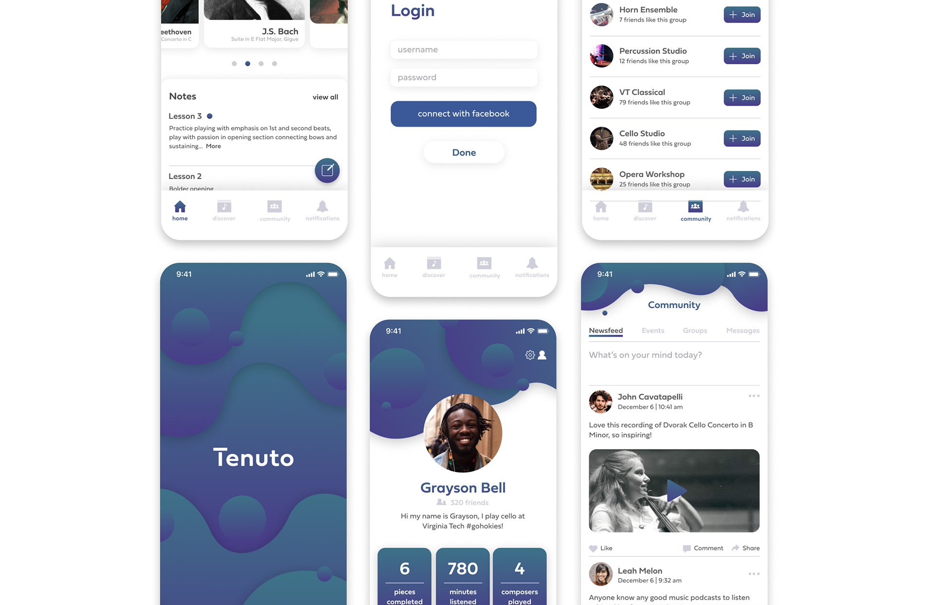
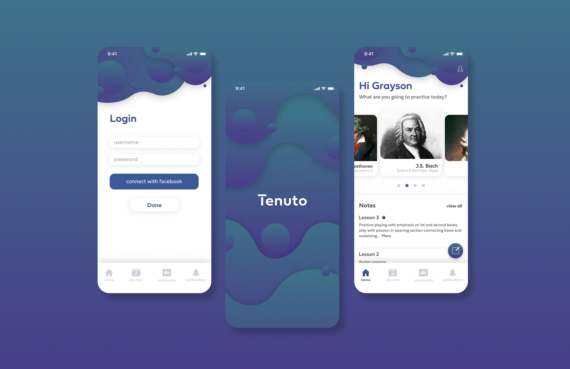
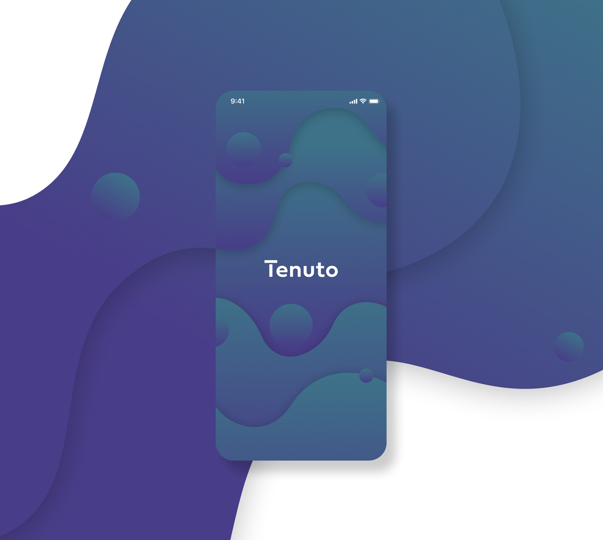
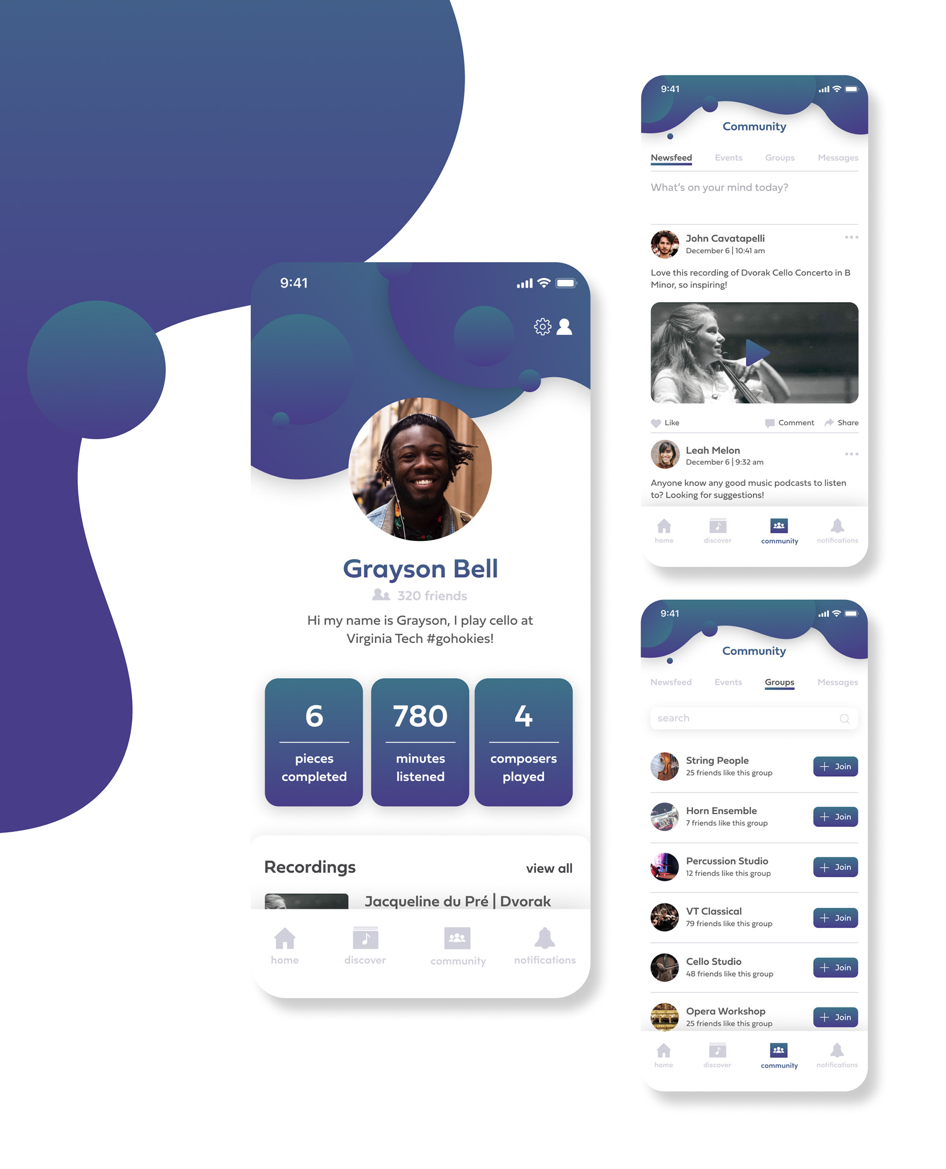
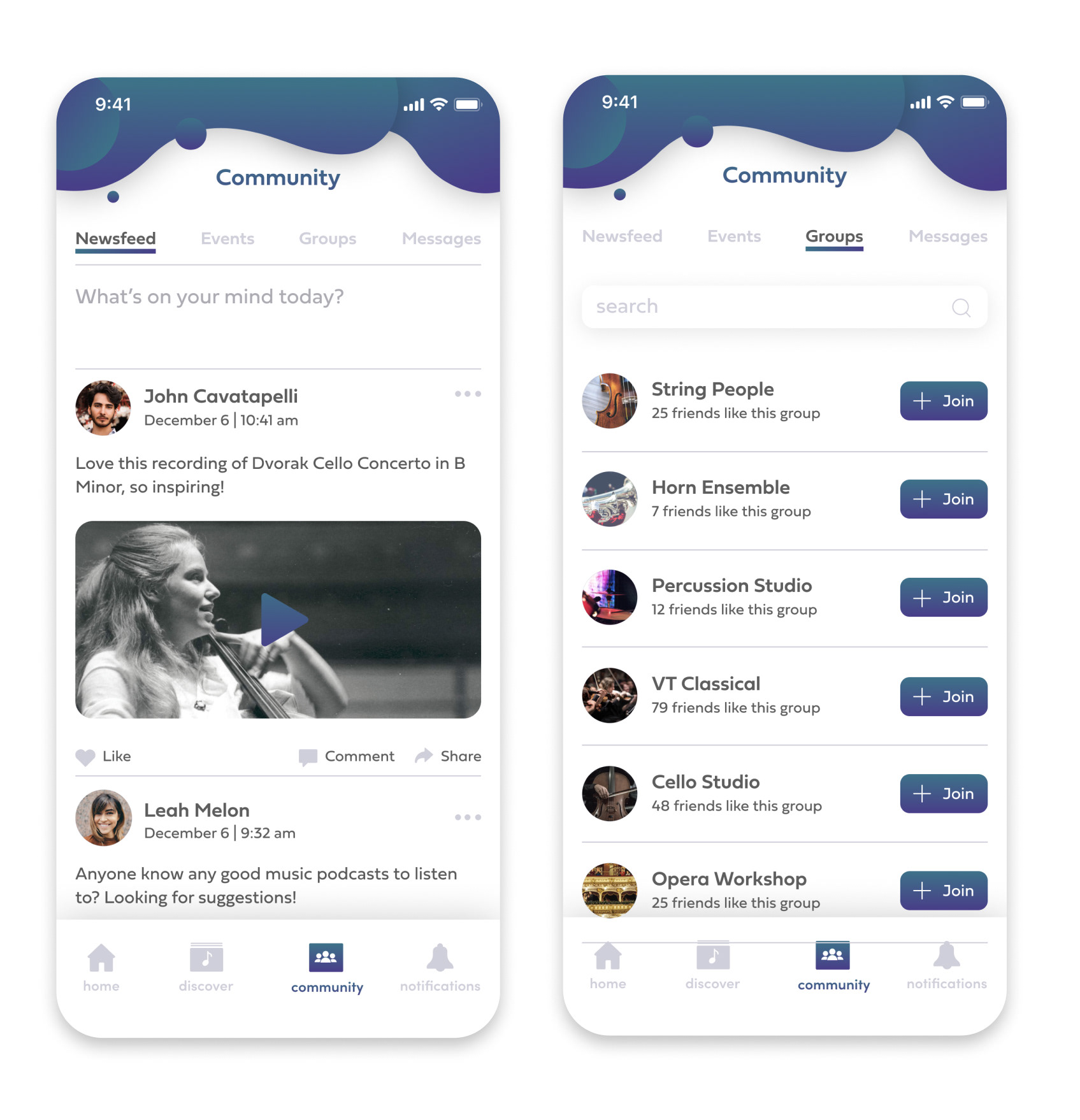
Final Design:
The final design focuses on 6 screens that highlight the features of three main pages that provide a general overview of the experience: home, community, and profile. I also consider how these screens might be integrated into an entire system. The previously stated goals were the backbone to this design, guiding each aspect of the experience. These goals were as follows:
Creating an experience that is efficient, effective, and intuitive
Emphasizing the value of organization
Enhancing professional relationships between musicians.
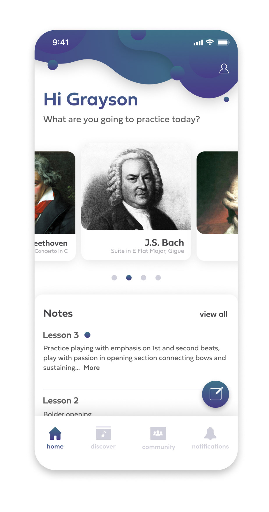
Home: This page shows a horizontal scrolling library of pieces that the user is currently working on, an adding button is included at the end of the horizontal scroll. Use of a horizontal scroll condenses the layout, allowing for quick and easy access to the pieces. Notes are included under this allowing the user a brief overview of recent notes. This content is placed in a tappable container that would allow a user to view a history of notes taken within the past three days. A “view all button” is included to allow the user to view all notes taken up until that point. The new note button allows a user to have access to quick note taking on the home page.
Community: Allows users to collectively share messages, attachments, and videos to friends. The scope bar allows for four separate pages: newsfeed, events, groups, and messages. A scope bar was chosen to allow the viewer easy access to several different views within the same tab. Events provide an overview of music-related events in the area, groups allow users to join organizations that interest them, and direct messaging allows users to directly message their contacts. The direct messaging allows users to have a platform where they can communicate with their teachers or students in a professional manner.
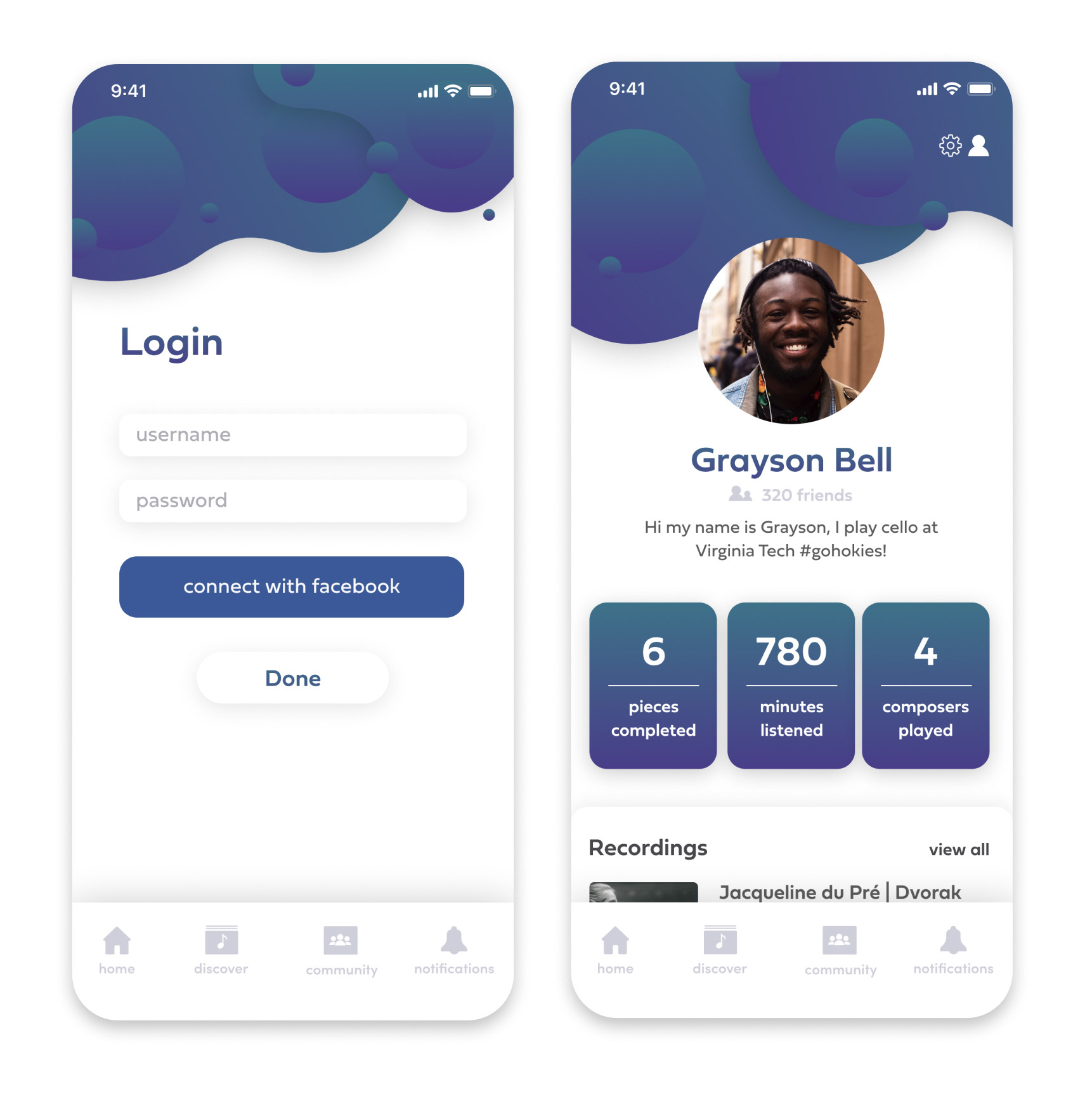
Profile: Provides an overview of the user’s account, statistics, and saved recordings. Statistics are included to encourage engagement with users by showing their cumulative progress. This page also allows the user to access their contacts and settings.
Reflection:
I feel that I learned a lot through this design process, especially when looking at design considerations for community features. This was not something I had explored in depth previously, and felt that this process really helped me to understand the details for designing a newsfeed. This process also helped me to better understand the technical aspects of user interface design in terms of accessibility and visibility guidelines. I was challenged to accommodate suggested button and text sizes noted in Apple’s Human Interface Guidelines which allowed me to view my design in a true prototyping setting.
I would love to extend upon this design in the future. I feel that the pages that I designed could be extended upon to provide complete user flows. I would also like to do more research on musician methods of practice beyond organization and communication. While the organization and communication have great importance to the user, there are also elements such as teaching and guides for technical skills that I feel could be incorporated into this design.
I would also be interested to see how this interface would change if used on other devices such as iPads. This design could easily be translated to different devices that would aid in physical performances. Musicians are already beginning to use screens during performances, for example, using pedal based page turning. Overall, I feel that I learned a lot and am very grateful to have been able to go through this design process.