Time: Fall 2019
Duration: 6-7 weeks
Skills: UX/UI, User Testing, Wireframing, Prototyping, High Fidelity Visual Design, Design Systems, Illustration
Tools: Procreate, Illustrator, Figma, InVision
Awards:
FLUX Interactive Design Winner (2021)
ADDY's Student Best in Show (2020)
ADDY's Student Best in Interactive (2020)
GLITCH MSU Best in Show (2020)
GLITCH MSU Best in Interactive (2020)
Climate change is one of the most heated topics in today’s media. There seems to be a lot of questions surrounding those two words. This, accompanied by a distinct lack of answers, creates a frightening level of uncertainty about the future. We can’t see climate change occurring like we might see cake rising in the oven. Instead, we see the effects of a serious issue that have lasting impacts on our environment. A large reality about climate change is that it’s scary, and without a clear-cut path to resolve the issue, it can be easy to ignore. So where do we begin to craft a solution?
Through intense research and conversation, I found that small steps are a good place to start. Able was created to provide step-by-step personalized guidance and encouragement to those who are looking to see their actions make a difference in the natural environment. Many of us have the ability to help mitigate global warming by simply adjusting daily actions. Although at times it is a seemingly overwhelming issue, climate change is not impossible to overcome! I hope that through this design, I am able to empower individuals to be a part of the solution to climate change.
The Problem:
How can I help to mitigate climate change as an individual? This was one of the biggest questions that I encountered during my research. Social media has been influential in the spread of global warming awareness, however, access to limitless sources of information has also led to confusion. Reiteration of alarming data that provides no reasonable solution has effectively decreased public engagement with climate based issues. As a result, questions regarding the roles of individuals and doubts over the significance of individual action have created challenges for climate mitigation efforts. Feasible opportunities for average individuals to take action in providing climate change mitigation are being buried by alarmist messaging and fake news. In a sea of global warming data, facts, and messaging, clear answers are not being provided and solutions are being lost.
The Solution:
So how does one create an experience that will make climate change mitigation easily identifiable while emphasizing the importance of individual action? By providing users with personalized and easy-to-follow sustainability plans. These plans provide achievable goals that are completed through daily activities that have been adjusted to directly involve sustainable practices. To me, sustainability is mindful consideration of natural resources that are in danger of being depleted or permanently damaged. With Able, users can create sustainable habits while tracking the progress and impact of their actions, much like a fitness or calorie tracker. This concept highlights the impact of the individual and celebrates their contribution to climate change mitigation. Through this design process, I wanted to emphasize a singular and clear message: the actions of individuals provide the building blocks for initiating real and identifiable change.
Audience: One of the difficulties in tackling climate change communication is knowing who you’re talking to. When something doesn’t live in a tangible realm, how does one identify a target audience? It's not as if you can physically sell climate change mitigation as a product for ages 6+. Instead, it’s a process similar to grouping or segmenting people based on shared perspectives and collective values. A study conducted by the Yale Program on Climate Change Communication and the George Mason Center for Climate Change Communication identifies six different kinds of Americans 18 years or older (Alarmed, Concerned, Cautious, Disengaged, Doubtful, and Dismissive) based on this grouping process. Each of these audiences share a set of ideals and opinions about climate change that are addressed and approached differently.
After researching all six audiences, I chose to engage with the Alarmed and Concerned. These two audiences are placed at the higher end of the Six Americas spectrum, meaning that they generally have greater involvement in climate change messaging. While both audiences are knowledgeable in global warming threats, studies have shown that the Alarmed and Concerned are uncertain on how to take meaningful actions towards mitigation. According to the Six Americas Messaging Strategies published by Yale and George Mason, “[The Alarmed and Concerned] are already strongly convinced of the reality and danger of climate change, so strong arguments on these topics aren't needed; they need instead information about solutions that are both feasible and effective”.
Tone: Information regarding the significance of individual action is another key feature in engaging the Alarmed and Concerned. According to the same Six Americas Messaging Strategies as cited previously, “the proportions who believe their own actions make a "some" or "a lot" of difference in reducing their emissions have decreased over the past five years by 13 percentage points among the Alarmed (from 68% to 55%), and by 23 percentage points among the Concerned (from 61% to 38%).” This information was critical in my design process and allowed me to further narrow my focus to two main points: significance of individual action, and clear messaging for reasonable goals and effective solutions.
My next question was this: how can I create an experience that is inclusive and resonates with a large, diverse audience? There is a need for individuals to be emotionally connected to an issue in order for engagement to occur. Based on extensive research, I found that promoting positivity, hope, and encouragement would be most effective in engaging and empowering users. In Lauren Feldman’s Risk Analysis, “Is There Any Hope?” Feldman notes that, “messages that stress climate change’s causes and/or impacts often do so by portraying a clear threat—either in terms of a danger, injustice, or both—they are apt to elicit fear and anger while minimizing hope. In contrast, messages that focus on actions that can address the danger or injustice posed by climate change offer the promise of a desired outcome and are thereby likely to evoke hope while reducing fear and anger”.
This research helped to define my messaging strategies, audiences, and tone. Moving forward, each design decision would be made with these three considerations in mind: Emphasizing clear sustainability goals and the importance of individual action, addressing the Alarmed and Concerned, and providing encouragement while promoting positivity.
Competitive Research:
Following my communication and audience research, I provided an analysis of two different existing apps, JouleBug and Greenstr. These two apps offered two different approaches to sustainability, one relied heavily on community involvement while the other focused on individual consumerism. The information collected during this research informed my design process on how existing companies were addressing climate change mitigation and sustainability through user experience.
JouleBug
Created in 2011, JouleBug is a community based sustainability tracker that focuses on creating game experiences through location based challenges.
Exploring Actions: users can view all possible actions available to log
Competing in Challenges: allows users to participate in community based challenges
Sharing is Caring: allows users to invite friends and colleagues to the app
Track your Impact: shows stats for logged actions and their impacts for different categories
Trophies: show achievements with action logging for significant impact milestones
Quick Tips: popups after “buzzes” show quick tips on how to apply sustainability
Greenstr
Created in 2017, Greenstr focuses on identifying sustainable products and promoting mindful consumption.
Scanning: allows user to scan any product
Rating: provides ratings of each product based on animal cruelty, human rights, and environmental conscious, allows for comparisons in purchasing decisions
Feed: news articles on sustainability and climate activism
History: shows previously scanned items
Both of these analyses provided valuable insight on how markets are currently promoting sustainability and helped to inform my design process moving forward. JouleBug’s approach challenged me to consider how an individual based platform might differ from a community based platform while Greenstr’s consumerism approach encouraged me to consider how users might interact with products within Able.
User Testing:
To begin user testing, I created a survey of 10 questions that would be conducted over two days through Facebook and GroupMe. Seventy-seven responses were collected from participants ages 18-65+, with the majority being 18-24. The data analyzed from this survey not only helped me to understand current attitudes towards climate change, but also allowed me to identify features that would be included within my design.
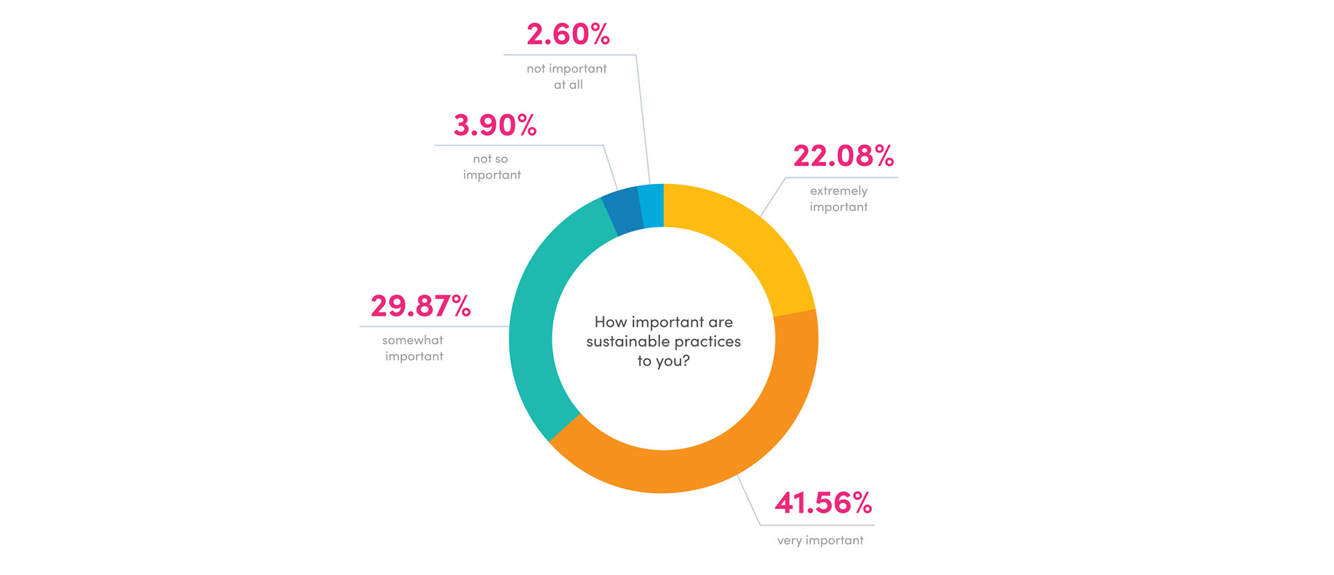
When asked to rate the importance of sustainability practices, 93% of participants rated sustainable actions at least “somewhat important”. 7% rated “not so important” or less.
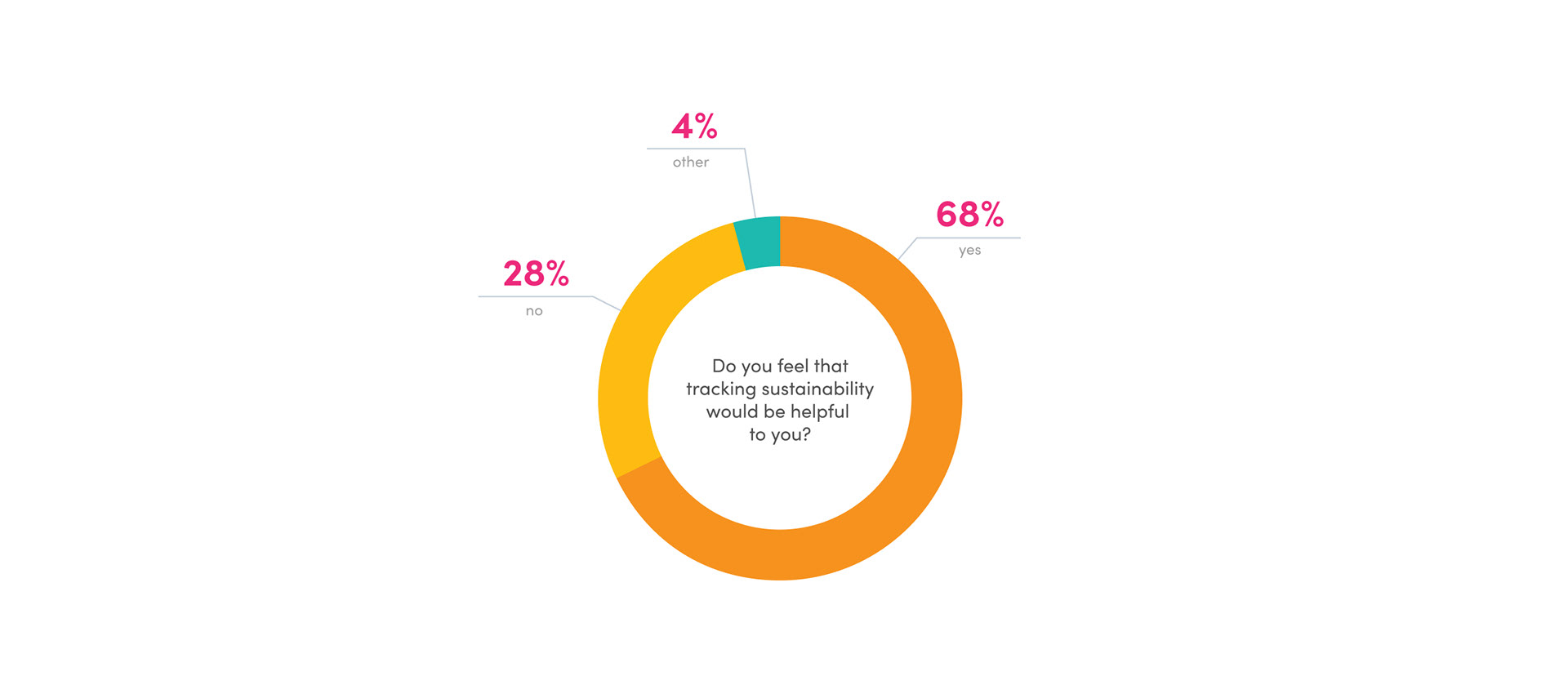
Only 5.19% of participants were currently tracking their sustainability. However, 68% of participants felt that tracking sustainability would be helpful.
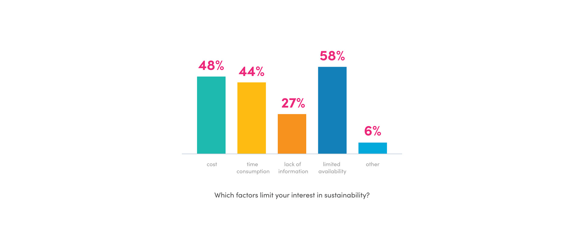
Participants were asked to check all factors that applied. The largest factor that limited sustainability was the availability of sustainable resources. Cost of resources and time consumption of sustainable actions accounted for the second and third highest factors.
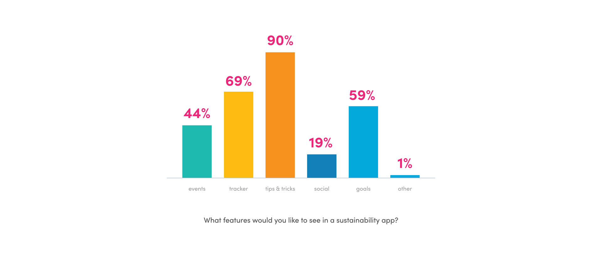
Participants were again asked to check all factors that applied. Tips and Tricks were chosen by 90% of participants. 69% of participants chose a tracker and 59% chose goals. This feedback challenged me to consider how tips and tricks could be integrated into the experience.

Goals:
When creating goals for this design, I wanted to keep in mind the three considerations that I had identified during research:
● Emphasizing clear sustainability goals and the importance of individual action
● Addressing the Alarmed and Concerned
● And providing encouragement while promoting positivity.
These considerations helped me to further define three main goals to fulfill during this design process.
1) Bright, uplifting visual design that conveys hope and positivity
Avoiding negative visuals will encourage engagement and help to foster the ideas of hope and positivity. Supplemental research regarding current climate change and sustainability has shown that current visuals relying on negative messaging are less likely to engage viewers. For example, according to The Politics and Business of Climate Change written by Even Lehmann, an E&E reporter, visuals depicting the negative effects of severe weather have been ineffective in engaging audiences because of their likeliness to invoke reactions of fear and/or anger. In the interest of cultivating a positive tone and the user’s sense of hope, creating an enjoyable visual user experience is critical in this design process.
2) Effective sustainability goals that are reasonable, achievable, and personalized towards the individual.
Creating an interface that supports goal-based achievements and avoids overwhelming solutions is vital to this design. Individuals are less likely to engage with sustainable actions if they are unreasonable, require copious amounts of change, or cause disruption to daily lives. Achievements of small, step-by-step goals not only motivate the user, but also demonstrate the feasibility and ease of climate change mitigation and sustainable actions. Creating personalized, effective, and achievable goals provides the user with a reasonable solution that they can actively take part in.
3) Emphasizing the value of individual actions by providing encouragement and showing data based impacts of sustainability.
Reiterating the main message found within this concept, the actions of individuals provide the building blocks for initiating real and identifiable change. Recently, there has been a decline in individual engagement with climate based issues due to a lack of clear and effective solutions. In addition to this, increased amounts of negative messaging and conflicting ideas have left individuals frustrated and unsure of their role in climate change mitigation efforts. Finding creative ways to emphasize and encourage individual action through visualization and data are important considerations in this process.
Prototyping:
The prototyping process was initiated by the creation of low-fidelity wireframes that mapped out 6 initial user flows. Each flow focused on a specific task that the user would need to complete, while also guiding the user through the app. This process helped me to refine navigation and system features to better suit the needs of the user.
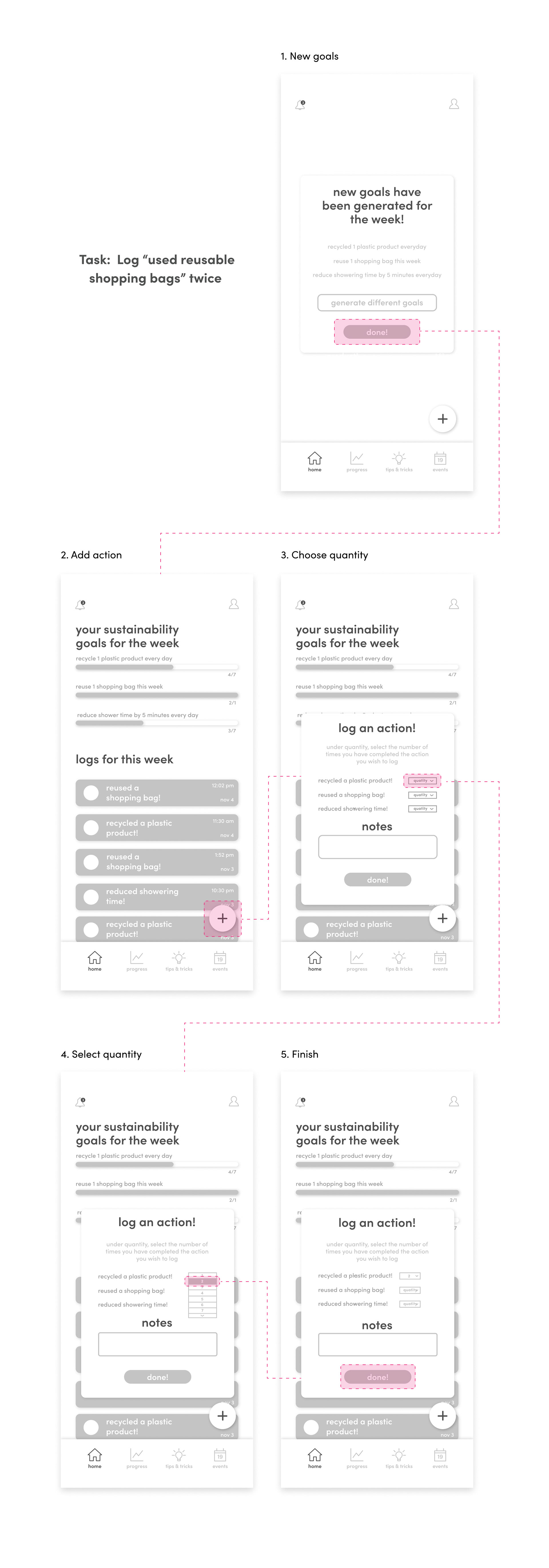
Ten users were asked to complete three separate tasks based on the 6 flows. These tasks included:
● Log “used reusable shopping bags” twice
● Favorite the “shopping with reusable bags” tip
● Comment on “The Big Plant” event
● Check Notifications
● View Profile
● Check Progress of recycling actions
Users reacted well to the overall design and completed most of the tasks without difficulty. Based on the several user’s overall feelings towards the concept and ability to navigate through the design, I received three main points of critical feedback:
● Several users were confused by the wording for the first task, logging “used reusable shopping bags” twice. This led to difficulty in entering the quantity in the action log dialogue box which had users first click a dropdown menu before scrolling to select a number. Feedback from this task noted that both the action of clicking and scrolling seemed redundant.
● A few users were hesitant when navigating the tab bar. Icons were provided for each tab, however they were not labeled. This lack of written identification made it difficult for the user to know what each tab was meant to be.
● Two users did not feel that goal completion would not be enough to keep them engaged with the app over time. This feedback challenged me to consider other forms of motivation involving physical items, competition-based elements, and/or badges.
Styles:
At this point in the design process, I wanted to take a closer look at my first main goal: bright, uplifting visuals that convey hope and positivity.
I first experimented with color palettes and found that meaningful use of white space and bright colors both balanced the design and established a positive and uplifting tone. Pops of color add emphasis to highlighted features while creating visual hierarchy throughout the experience. Throughout the design, gradients are used to create interest and variation between the highlighted elements. My choice to utilize gradients was inspired by the idea of portraying effective movement towards a solution.
In addition to providing a positive and hopeful tone, I wanted the language used within this design to appear conversational. I chose a SofiaPro because of its square x-height and friendly appearance. This typeface also offered a wide range of weights that I utilized throughout the app to create typographic hierarchy and meet accessibility guidelines.
The theme of these visuals are varieties of leaves that not only represent the diversity of plant life, but also help to create a connection between individuals and the natural resources they are working towards preserving. This connection serves as a hopeful reminder to individuals that their actions are having a positive impact on all kinds of wildlife.
Visual elements within this design are also used to further design the user interface system. For example, throughout the design, colors are used to indicate a specific category of sustainable actions. In addition to this, rounded edges and soft shadows indicate an interactive or tappable moment while also highlighting specific features.

Final Design:
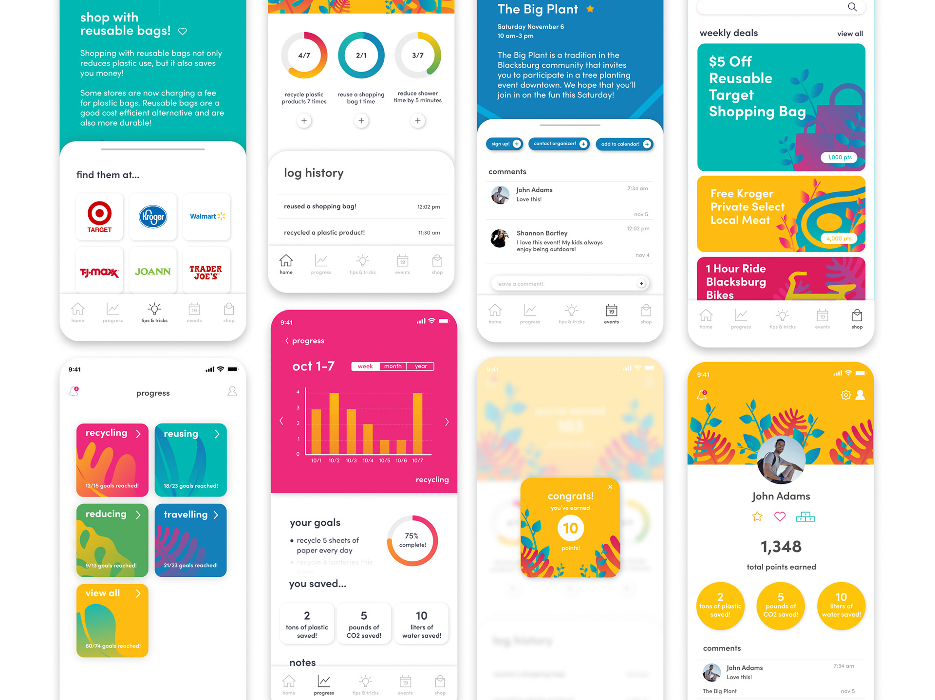
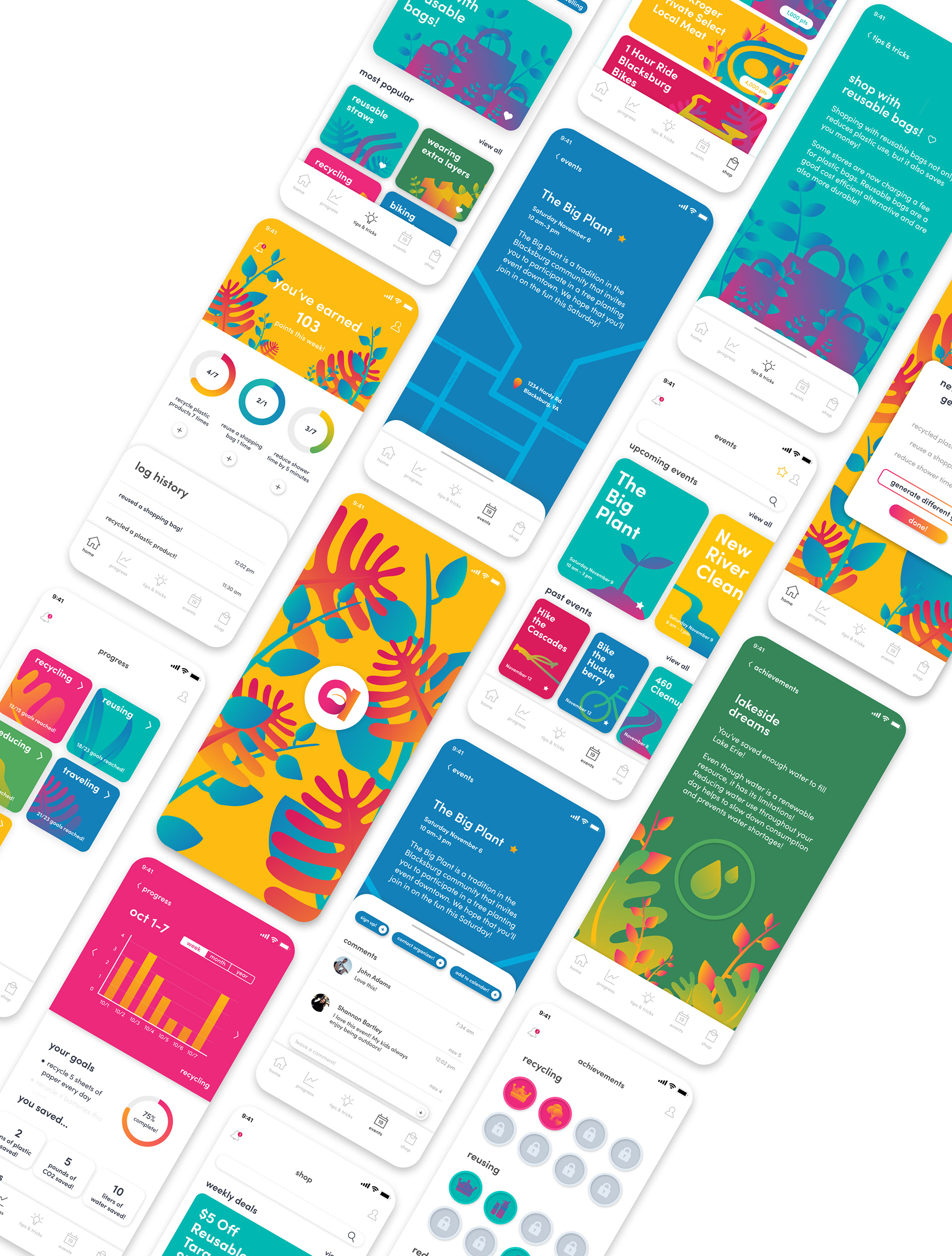
The final design includes 34 screens and 8 user flows that feature:
● Personality quiz
● Goal-based action logging
● Tracking and progress
● Tips and tricks
● Community events
● Points-based shopping
● And profile sections that highlight personal achievements and leaderboards.
This design was created keeping in mind several main concepts, considerations, and goals that I wanted to communicate, address, and achieve throughout this process. As a summarization, I wanted to reiterate the following elements.
Concept: Create a positive experience that makes climate change solutions easily recognizable while communicating that the actions of individuals provide the building blocks for initiating real, identifiable, and effective change.
Considerations: Emphasizing clear sustainability goals and the importance of individual action, addressing the Alarmed and Concerned, and providing encouragement while promoting positivity.
Goals:
1) Bright, uplifting visual design that conveys hope and positivity
2) Effective sustainability goals that are reasonable, achievable, and personalized towards the individual.
3) Emphasizing the value of individual actions by providing encouragement and showing data based impacts of sustainable actions.
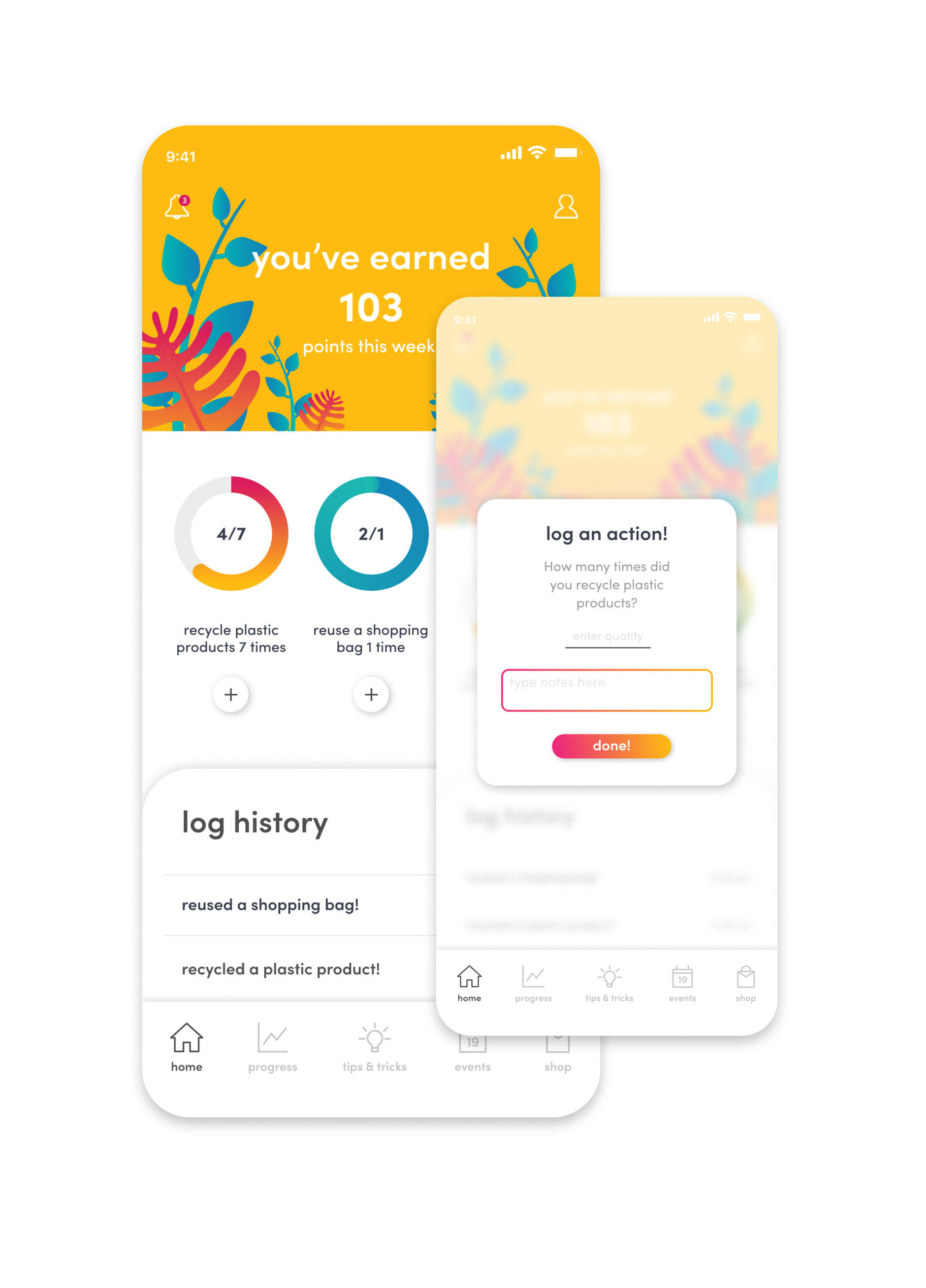
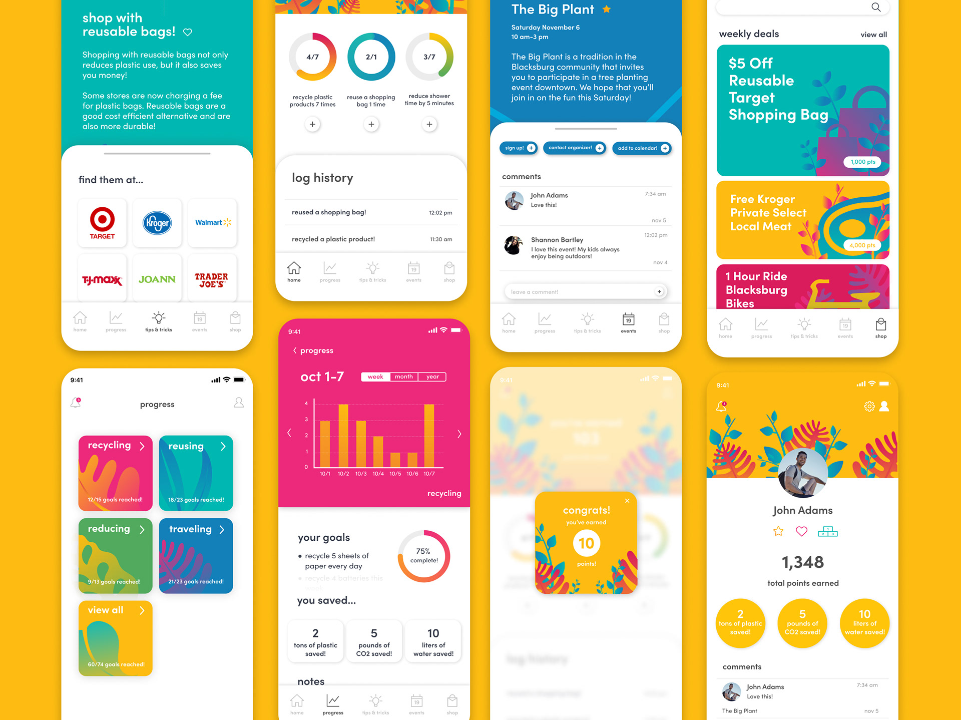
Goals: Each week, three new goals are generated from five different categories: recycling, reusing, reducing, traveling, and other. Goal generation is informed by data collected in the personality quiz. Limiting the number of goals per week eliminates the possibility of creating an overwhelming experience by setting reasonable expectations for the user. The levels of completion for weekly goals are represented by progress rings. After refining this data visualization, I chose to utilize rings instead of bars. A closed ring allows the user to feel a sense of accomplishment after completing a goal. Completion of these goals also unlocks fun badges that highlight and celebrate the user’s achievements.
Based on feedback received during the prototyping phase, I designed a point system to accompany action logging and goal completion. Each goal is assigned a point value that will be added to the user’s total earned points upon action logging or completion of the goal. Points can then be spent on local deals that promote sustainability in the shop tab. Total earned points will determine the user’s spot on the leaderboard which can be found under the profile tab. This approach provides the user with a physical form of engagement and encourages sustainable consumerism as well as community building.
oooo
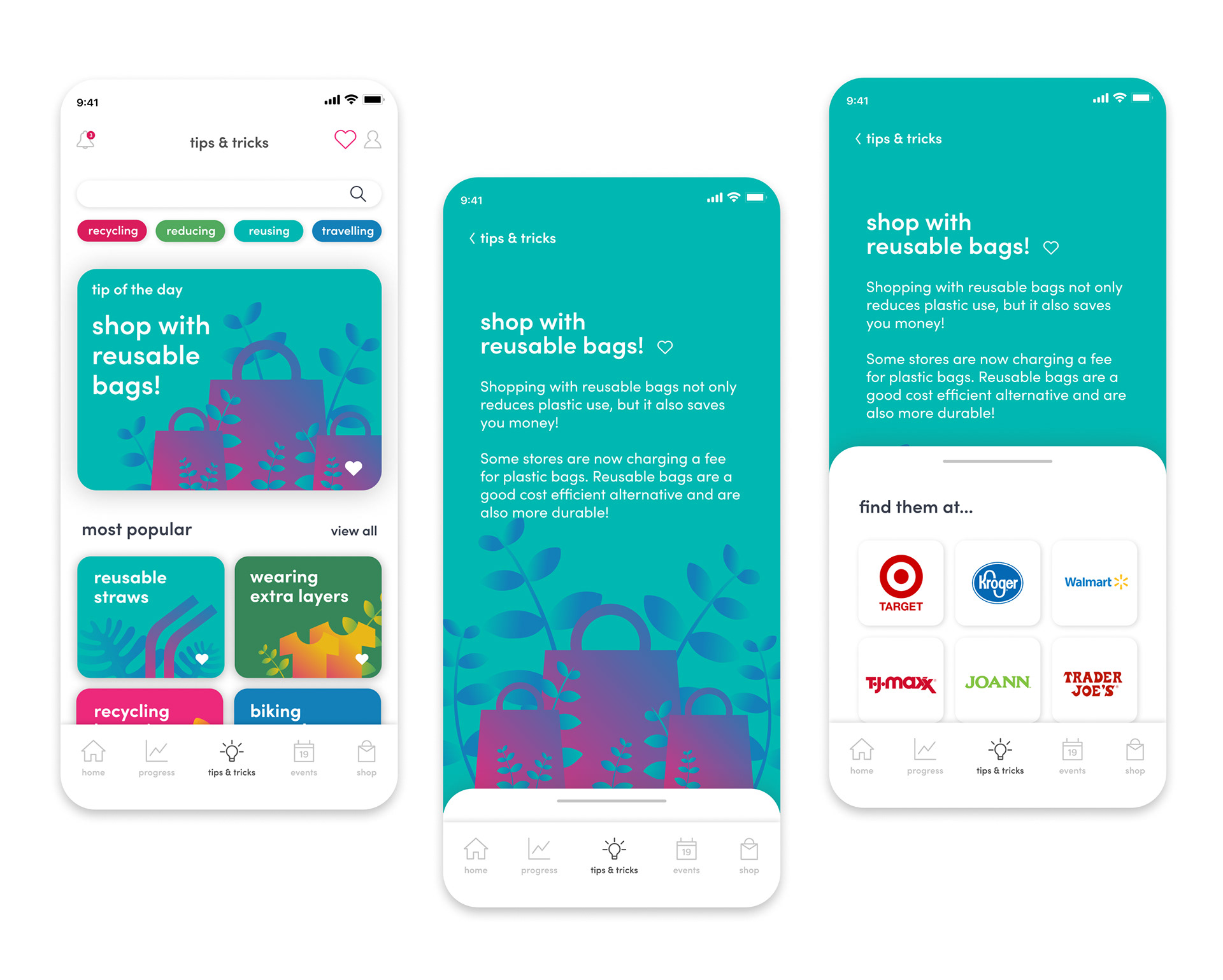
Tips: Tips and Tricks allow the user to search and explore pre-installed tips on how to practice sustainability apart from weekly goals. Pre-installed tips ensure that information is accurate by allowing tips to be fact-checked and quality-approved before publishing. Individual tips can be favorited and filtered through the heart icon indicated in the top right corner. Sectioning provides the user with a clear breakdown of different categories such as most popular, featured, etc. Viewing of individual tips provides a description and listings of local stores that have sustainable goods relating to each tip.
oooo

Progress: Tracking is based on cumulative data from actions logged towards goal fulfillment. This feature allows the user to analyze their progress in each of the five categories (recycling, reusing, reducing, traveling, and other). Bar graphs allow the user to make clear comparisons of their progress at different points in time. These graphs can also be toggled to provide views of progress based on a certain week, month, or year. The layout is meant to be flexible for varying amounts of data. To further emphasize the impact of the individual, this feature allows users to see exactly how their actions are affecting natural resources such as water and CO2.
oooo
Events: Locally based events are sourced from public platforms and allow users to participate in gatherings that promote sustainability within the community. Each event features a description, a map detailing the location of the event, and a comment section for community engagement. Feature buttons allow the user to sign up for the event, contact the organizer, or add the event to their calendar with one tap. These actions are easy to access and create a smoother communication experience for users. Starring an icon will save it to your favorited events which can be filtered by tapping the star icon in the top right corner. Events are also sorted by date, separating upcoming events from past events.

oooo
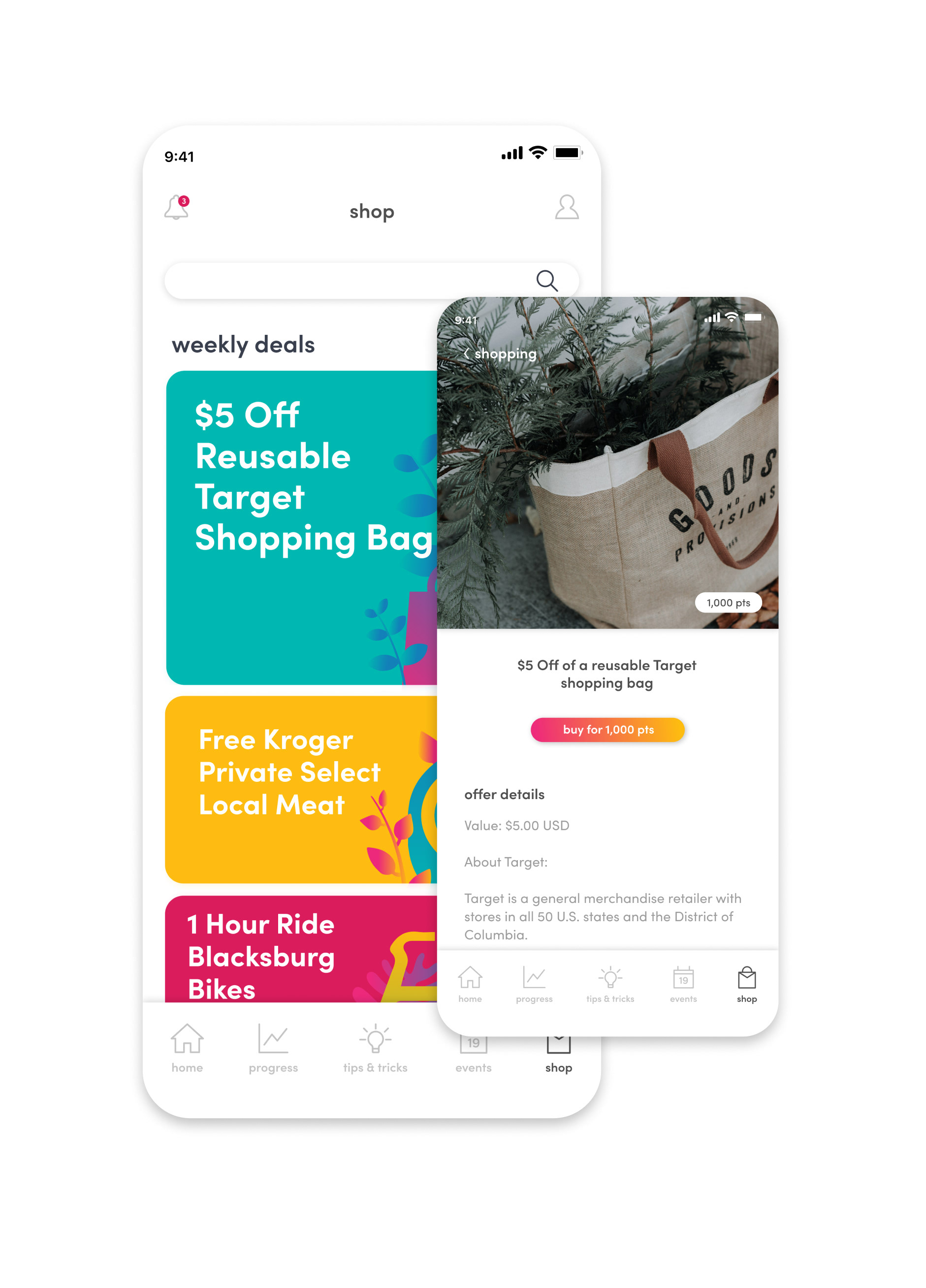
Shop: In addition to creating a point-based earning system, a shop tab was created to meet the needs of the user. This feature provides discounts and coupons to local sustainable products such as bus passes. Each offer includes a description of services as well as terms and conditions. After tapping the “buy” button, the user must confirm or cancel their purchase. This second confirmation screen helps to ensure that offers are being purchased with intent. After the user has confirmed their purchase, they are sent an electric coupon to redeem their offer.
Profile: The user’s profile contains badges and impacts from goals achieved. The leaderboard compiles data from all users and provides an overview of the top ten goal achievers. Favorited events and tips are also available under the profile tab. Settings can be adjusted for personality quiz answers and notification settings.


Reflection:
Able is the largest app design I have created. At first it was difficult to wrap my head around all of the parts and pieces, but I loved every moment in the process of making this concept a reality. Extensively researching, user testing, and prototyping gave me the tools to master my design. This critical data not only supported every design decision throughout this process, but also allowed me to feel confident in my design solution.
Creating this experience also challenged me to think differently about user interfaces on a larger scale. The three considerations that I had defined earlier in the research process played a large role in how I shaped the user’s experience. Audiences, messaging, and tone were several elements that I was constantly reminding myself of throughout the process. Each design decision both visual and experiential was focused on a larger goal. Completing the circle and creating connections between the research, goals, and considerations not only laid the foundation for this design, but created an intensely gratifying personal experience as well.
Detail work within this design was endless and exciting! Prior to this experience, I wouldn’t have anticipated spending extensive amounts of time considering how different graphs might relay the same information. However, I found that the ability to be fiercely specific within design is incredibly rewarding and necessary in creating user flows.
This process also helped me to learn more about accessibility and its implications for experience design. Although I tried to be consistently mindful of accessibility throughout my design, I realize that there are several elements that wouldn’t have met guidelines, such as white text on a yellow background. Accessibility is incredibly important and I want to challenge myself to consider how it can be integrated and enhanced in future designs.
One of the greatest challenges throughout this process was learning how to think in terms of business. How would the shop feature of my app function between users and local businesses? Is sourcing events from public platforms the best practice? These were questions I asked myself during the design process but couldn’t find answers to. In the future, I want to learn more about the relationships between businesses and consumers in order to create feasible, and sensible experiences that can thrive on the market.
I have been and always will be extremely passionate about the environment. This process has taught me so much, from honing my design and user experience skills to gaining extensive knowledge on climate change mitigation audiences and communication. Moving forward, I believe that this kind of user experience and interaction will be vital in initiating progress towards preserving the natural world.