Time: Fall 2019
Duration: 3 days
Skills: UX/UI, Wireframing, High Fidelity Visual Design, Design Systems
Tools: Figma
Awards:
Flux Interactive Design Winner (2020)
Who doesn’t love a good game? As a kid, I remember playing Ghost in the Graveyard outside on particularly spooky nights with my friends. A current concern with today’s society is that technological engagement allows children to spend less time outdoors. Although often perceived this way, I don’t believe that technology should be seen as an obstruction or substitute to outdoor activity. When used in moderation, it can be a powerful tool to promote healthier lifestyle for kids of all ages.
The Challenge:
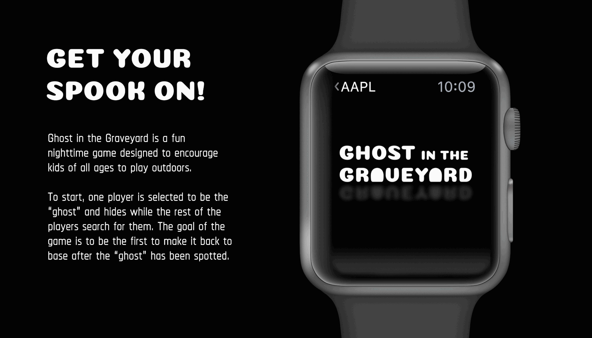
Ghost in the Graveyard is a old time tradition that involves one player who is selected as the “ghost” and other players that search for them. Whoever makes it back to home base first is the winner. Creating a game interface for kids that promotes outdoor activity seems like a contradictory problem. How do I create a kid-friendly experience that combines technology with physical activity?
The Solution:
By creating a playful interface that not only explains how the game is played, but adds to the experience as well. Let’s also say that this design should be completed in three days because, why not? Throughout this process, I wanted to focus on elements of surprise and features that would aid the user’s understanding of the game. Keeping in mind that kids can be of all ages, this experience is tailored to be inclusive and fun for everyone.
Research:
So how much is actually known about the trends between technology use and its impact on children’s health? A study done by the OECD in 2019 discussed the results of the Goldilocks Effect, a concept that shows moderate use of technology as being beneficial to health while too little technology engagement might be detrimental. Participants of this study were shown having the best well-being when using technology for about one hour. This helped my design process by helping me to consider how my design might function within a specific time frame.
This app was created for Apple Watch with the idea that children playing outdoors would find the interface to be less obtrusive to their experience. This process challenged me to learn how to design for a device that I hadn’t previously worked with. Apple Watch’s three main points for design focus on experiences that are glanceable, actionable, and responsive. These three concepts helped inform my design decisions when creating this app. How can my design provide maximum information without causing the user to spend long amounts of time with it? How can I ensure the user’s needs at any point in time? What kind of features can I provide that will allow for snapshots of information? These are considerations that I continued to incorporate into my design.
Goals:
My goals throughout this process were centered around creating a kid-friendly interface that could quickly and succinctly convey important information for children on the run. I felt that this would be best accomplished through a clean design and less screens. I also wanted to enhance the experience through different interactive moments within the app such as location based and player information.
Styles:
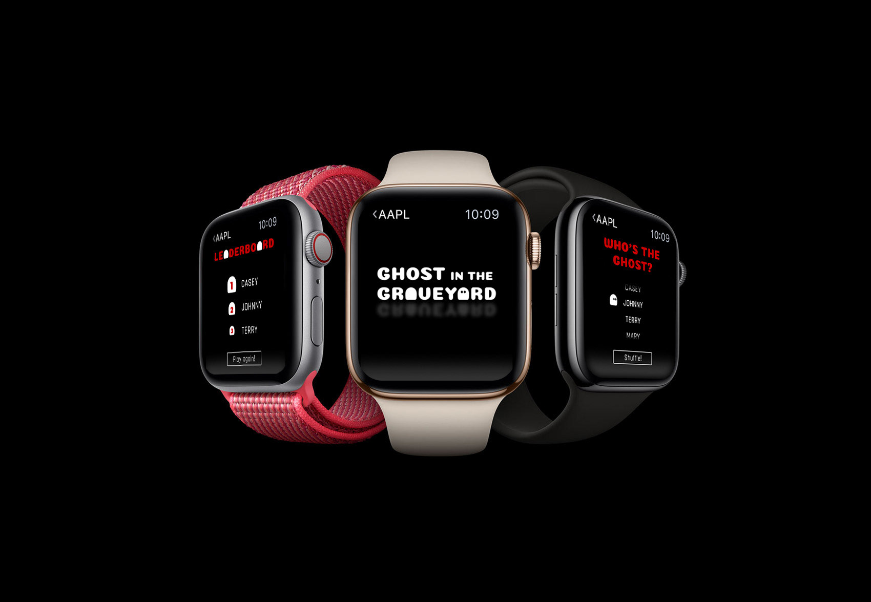
The styles for this design were created in regards to the visual appearance of the entire system. I worked with white or bright red type against a dark background because I felt that it would be easiest to view in low light. It also reflects the mood of a spooky nighttime game without feeling too sinister. I chose to use a round typeface and had fun with the concept of a ghost moving between the gravestones created by the “a” letterforms. This created a friendlier experience for the user, playing with the idea of a cartoon ghost within the interface.
Final Design:
The final design highlights seven of the main screens within the app including the splash screen. I felt that these screens best represented the features that included within the experience and allowed the viewer to have a full sense of how one might interact with them. During this process, I continued to reevaluate and apply the goals which I had set before: creating a playful interface that not only explains how the game is played, but adds to the experience as well
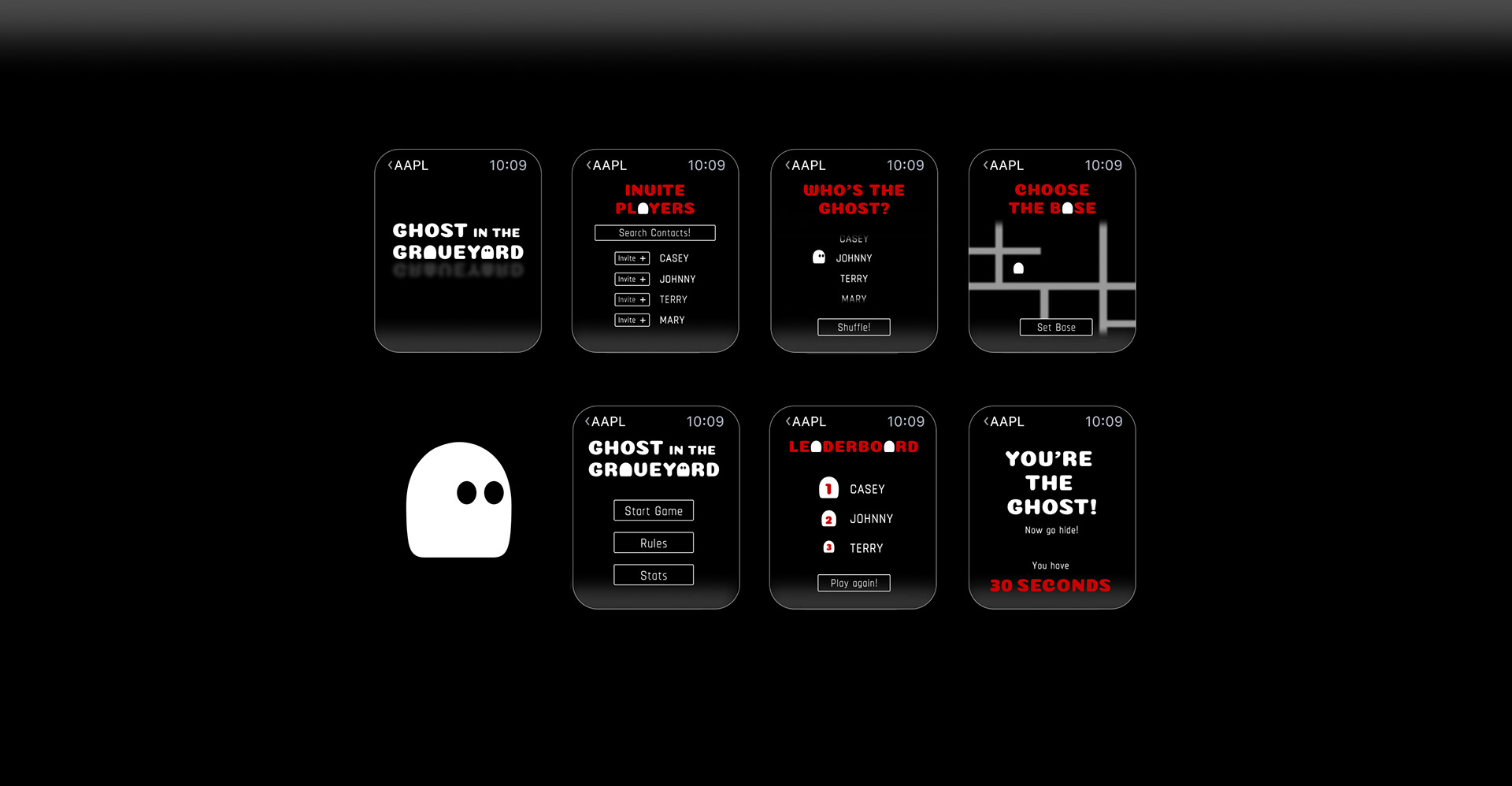
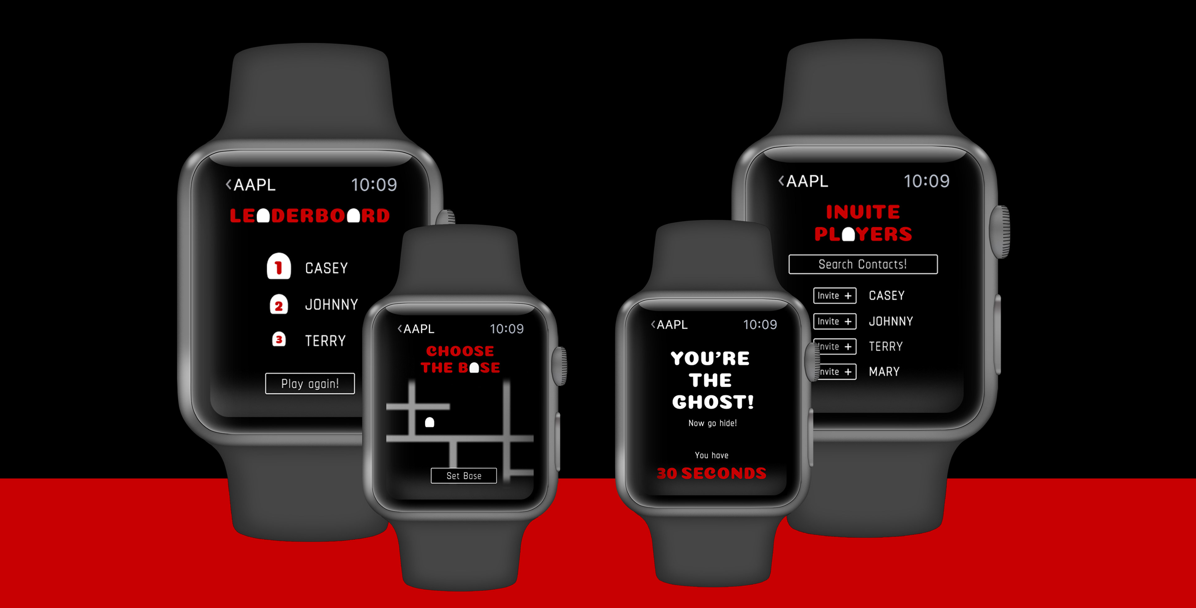
Home: The home screen allows the user to choose from three different options: to start the game, to view the rules, or to view the leaderboard. These options allowed the user to have quick and easy access to the three main features of the game from the start.
Player Invite: Player invite would be generated from current contacts within the user’s device. This creates a more accessible experience for kids who might not have social media accounts to connect with.
Map: The map utilizes the Apple Watch’s ability to track and locate the user at any given point while wearing the device. This allows for easy game set up and identification of users in cases of emergency.
Who’s the Ghost?: Who’s the ghost is a fun interactive screen that randomly picks a ghost from the player’s names. Instead of worrying about who “gets” to be the ghost, one is picked out of the database, also creating a sense of surprise for the users.
You’re the Ghost!: This screen would only be shown on the ghost’s screen as indicator that they have been chosen to hide. The countdown timer would be shown on their screen to show how much time they have to look for a sneaky spot. This creates an easier way to communicate time instead of having to rely on being able to hear the group countdown.
Leaderboard: This features keeps the element of good natured competition and encourages continued playing outside. The more times you win, the higher your name will be on the leaderboard!
Reflection:
I feel that I learned a lot throughout this process, and had an extremely fun time in doing so. Learning about the guidelines and standards for Apple Watch devices was incredibly useful and allowed me to think of how apps might function on the Apple Watch in the future. This process also brought to my attention how design differs for different age ranges. Prior to this design challenge, I hadn’t had much experience with kid focused design. However, after creating this app, I feel that it’s a wonderful way to engage kids while still creating high level design.
Something I feel that I could improve on would be use of repeated functions throughout the system. There are moments where it is unclear how a user would navigate back to a previous screen which is something that would need to be addressed.
Overall I feel that given the restriction of designing these screens in three days, I was able to learn a lot and develop a concept that was translated into a visually appealing design. I really enjoy challenges and felt that this was a great opportunity to enhance a game experience in a unique and interesting way.